Thursday 25 November 2010

Questionnaires for my target market

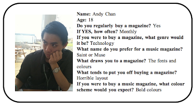
To research into my target market, I used a series of different methods. The first method I used was to give out questionnaires to the age range I have mentioned for my target market and gave it out to a sample of 10 people. This is a draft of the questions I have given out:

[Please click here to view]

Here are a few of the ones i got given back:


Photobucket


The variety of answers:

Do you regularly buy a magazine?
Yes 8 No 2

If yes, how often?
Daily 0 Weekly 5 Monthly 3 Other 2

Genres of magazine purchased:
Fashion 4 Sport 1 Technology 1 Gossip 2 Other 1

What name do you prefer for a music magazine?
Saint 6 Muse 4 The Beat 0 Other 0

What different aspects of a magazine draws you towards it?
  • The fonts and colours
  • The cover
  • Genre
  • Images on the front
  • Design throughout the magazine
  • The tidiness
  • The models
What tends to put you off buying a magazine?
  • Horrible layout
  • Price
  • The busyness of the pages
  • Tacky design
  • Content which is irrelavant to my interests
  • Bad Colour scheme
  • Amateur look
  • Adverts
  • Boring articles
  • Colourless, boring
  • Bad presentation
  • Too focused on one topic
  • Too repetitive
What colours would you expect if you were to buy a music magazine?
  • Bold colours
  • Retro colours
  • Bright colours
  • Blacks, dark colours but with vibrant colours (majority of vote)


Wednesday 24 November 2010

Names for the Magazine


Examples of music magazine names:

  • Mojo
  • NME
  • Kerrang
  • Q
  • Rolling Stone
  • Wire
I have come to the conclusion, after looking at various music magazine titles, that the names of the magazines generally are words associated with music with connotations of the genre of the music my target audience will be interested in. The titles are generally punchy, short, simple and easy to remember. Therefore, here are my ideas for my music magazine...


I have developed this mind map of the ideas of names for my magazine:


The name I have chosen for my magazine is 'Saint'. This is because I think it provides the right codes and conventions for the genre of my magazine, and teamed with a good photo for the front will play a good role in showing my target market that this magazine is for them.


Sunday 21 November 2010

Photographs taken which could potentially be in the magazine


Photo 1:

I think this would be the best photo for my front cover as the model is looking at the consumer, the lighting is perfect and it is black and white, which is what i intended to use.

Photo 2

I think this photo is over-edited for my front cover, but could be used for A4 sized photoshoot pictures in the magazine. I think the colour boost in this photo is too much and the saturation has been put too high as well.


Photo 3

If i were to use this photo, I think it would look best in my double page spread as A4 size. This is because the model has no eye contact with the consumer and looks very natural. 

Photo 4

I think this photo would be better for the double page spread or the contents because it looks extremely edited and couldn't be used on the front cover because it is landscape and looks sort of 'cold' and I think it would send away any consumers.

Here are some more photos I have taken but have taken the liberty in showing them from a photobucket link in a slideshow form. The slideshow should show the majority of the photos I have taken with their edited photo next to it. Please use the play, forward and back buttons to change speeds.
** PLEASE PRESS 'VIEW ALL' TO SEE HOW I EDITED THE PHOTOS**


Friday 19 November 2010

Considerations of Mis en Scene for Photoshoot

Teenagers in my target audience will have their own fashion ideas and preferences. As I want to reach out to them, I need my magazine to provide them with the right semiotics, codes and conventions of their fashion senses so they feel 'at home' with the brand. Predominately worn would be clothing such as jeans, tee shirts, and quirky jewellery.

For my photoshoot, I would like my model to be wearing informal clothes which provide the camera with a relaxed feel. I also don't want them to wear anything bright or too formal as I want the attention to be transfixed on everything around them and also, most importantly, the facial expressions. However, I believe I will use editing techniques in Photoshop to control the contrast and colour settings to change any colours of clothing etc I do not like. The camera shots I will use will be shots such as mid shots, full shots and close ups to convey these ideas.

Examples of things I would like my model to wear are:


Wednesday 17 November 2010

Before I do my photoshoot and organize a model, I have decided to map out where I would like to take the photos and what sort of areas are around the main place I am going.

Photobucket

Around the main area are:
  • Seafront
  • Pavillions overlooking sea
  • Quirky looking houses
  • Old fashioned/hippy cars usually
  • A pretty area to sit
  • Water fountain
  • Victorian looking clock over the front entrance
I think this area will be perfect for my photoshoot because it allows me to explore the horizons in getting a perfect shot for portraying the image I want my target market to view. I can use the different areas to get different shots then I can choose which one I prefer that would be suitable for the different areas for my magazine - Front cover, double page spread and contents.

Tuesday 16 November 2010

Possible Area for Taking Photos for Photoshoot

It is important for my magazine to convey the right connotations by giving the right denotations. The area in which I think will be suitable for my photoshoot is in Southend-on-Sea where there is a pretty grass area overlooking the seafront and an area to sit around an ancient clock and flowers. Here are some pictures I found off of Google Maps:


I also think i will use a backdrop of black and white New York City for the front cover picture of the magazine as I think this will give it the edgy, chic feel to the magazine.

Here are some photos which inspired me:


The backdrop I will use for the background of the front cover shoot is similar to the second picture. The sizes are as follows:
Width : 140 cm
Height : 180 cm
Length : 192 cm

It is on a canvas which adds life and depth to the picture.

This is my inspiration:
 
Music Magazine Publishing Research


Another important area that has to be researched is the publishers of the music magazines. Music magazines are a public relations way of getting music news to the public. The music news is typical to the target audience and attracts audience through the language (researched earlier on) and the type of news it is. For example, a rock and heavy metal magazine such as Kerrang would typically not get attraction by using Katie Melua as a main news theme as her genre of music is blues and jazz. Therefore, marketing of these magazines is very important making publication very profitable.

Magazines such as MOJO, Q and KERRANG! are all published by media group Bauer. The Bauer Publishing Group has grown into a worldwide publishing and media company. The Bauer Publishing Group comprises 282 magazines worldwide in 15 countries, as well as TV and radio stations. Bauer started in the UK with the launch of Bella magazine in 1987 and as H Bauer Publishing became Britain's third largest publisher. Bauer further expanded in the UK with the purchase of Emap Consumer Media and Emap Radio in 2008 to become the UK's biggest publishing group. 
 (please press here to view webpage on the company) 


However, these magazines are priced at different prices; MOJO being roughly  £3.95, Kerrang! at £2.20 and Q at £3.90. These different prices would reflect the content within the magazine and how much you recieve. 

Target Audience Interests

Here are places, locations, clothing shops and things I think my target audience would enjoy.

Shops

Topshop 
Urbanoutfitters 
Henry Holland 
Quirky off-the-beaten-track shops

Places/Locations

The o2 Arena 
Hyde Park
KOKO music venue 
Denmark Street


Jewellery / Etc

Accessorize 
London Boutiques
Rough Trade (record store)

Monday 15 November 2010

Brand Profile
Muse is a magazine which will be posted weekly, containing every little thing needed to be known about the alternative rock genre of music of that week. It will be best known for it's 'What's hot and what's not' singles catergory. It will give readers the most exciting news about their favourite bands and artists and will be accessible over the internet, as well as the magazine. It will give readers award winning features, reviews on new music releases and on gigs around the country as well as look back at some legendary artists from history.


Reader Profile
My magazine will be aimed at middle class females aged around 16-25. I have chosen this profile because I would like the magazine to be young and quirky. The magazine will include discounts and the best concerts and gigs such as Glastonbury and Reading which are messy but all about the good music and the atmosphere. I would think that higher class readers would preferably want expensive, clean spots.
There are the things I think my readers would like:


Sunday 14 November 2010

The main points I have gathered from analysing music magazines that I need to add to my music magazine to suit my target audience are:


Language:

  • The language has to have connotations of the genre of music I am aiming my music magazine to be.
  • However, the language is fun and exciting, making you want to pick it up
  • Usage of bold and varying text sizes reinforce effects drawn from the language chosen and make the magazine look eye-catching
  • Boldness and italics also make the particular words chosen with the effect stand out to enhance what they are saying
  • The colours of the fonts are very important as they have connotations of what the target audience is. If, for instance, I chose pink and white as a colour scheme, it would automatically attract females as the colours are feminine and girly
  • Short and punchy headlines need to be used - nothing long otherwise it is too much to read and they need to stay interested
  • Bold effects and the convention of having large font on a magazine front cover are implemented in order to attract the audience
  • Lastly, puns are often used to allow the reader to think and relates to other topics, too.
Institutions:
  • Most likely a high profile music magazine company will have produced this magazine
  • Companies such as Kerrang, Q and NME often have tv channels and radio stations as well as music magazines as a way of producing music news and entertainment around the countries.
  • Prices are always on the front cover, usually in a corner or below the title, next to the barcode
Audience:
  • The audience is very important to consider when producing a music magazine
  • The colours, genre, media type and language will all change with different target audiences
  • Once the audience has been put down, i will need to do some market research and find what are their favourite colours, favourite types of media, pictures etc
Representation:
  • The musician on the front has to relate to the viewer and has to be able to build a sort of relationship with them
  • They have to be 'in fashion' with the target audience and be a hit at that current time
  • The musician throughout the magazine has to bring a certain something to the magazine which interests the reader.
Research of the Current Music Magazines

I have shown my research in a 'Prezi' format.
Please click text areas to be zoomed into them to read them more clearly, and use the + and - buttons to zoom in and out. 


If you cannot see the embedded file, please press here to view it.