Tuesday, 14 December 2010

Making the Front Cover

This is what I started off as:


 I then thought the main heading 'Sarah Jane Parker' should stand out more because that is the main focus of my magazine. I chose pink because my magazine is aimed at women who are attracted to pinks and greens.


My main next focus was to settle on a font. I decided I didn't like the current font I had left it in because it looked too unprofessional. The font needs to stand out and look as though it was made by a professional and wasn't just drawn up on a program such as Word or such.


I settled with a font called 'Polar Shift' which I think has achieved it's purpose of making the magazine look more professional and edgy.


I then thought the right hand side of the magazine looked too bare so I moved some things around. 


This is my finished front cover:

Saturday, 11 December 2010

Logo for Saint

 I think this would be the most appropriate logo for my magazine because it is chic and edgy, just like my target market. It is also aesthetically pleasing to the eyes.

 I don't think this is appropriate because I would associate this font with a sport magazine as it is very straight and upmarket.
Neither this would be appropriate either because I think the font looks too messy and is quite hard to read. However, it does refer to music as the letters are musical instruments.

Advice from Target Market

1. Ellie, 17 - I prefer the first font as it has a great feel to it
2. Romy, 17 - I like the first font because it relates to music
3. Sam, 19 - It depends on what information you're trying to get across. I don't like the third font because that seems to relate to classical music. I do like font 1 and 2 though. However if you're trying to get to alternative rock interested females, I would go with font 1.
4. Nick, 22 - Font 1 is cool
5. Nicole, 24 - Font 1!!


It is quite clear that my target audience prefer font 1 so this will be implemented into my magazine.

Monday, 6 December 2010

Design Ideas for Front Cover

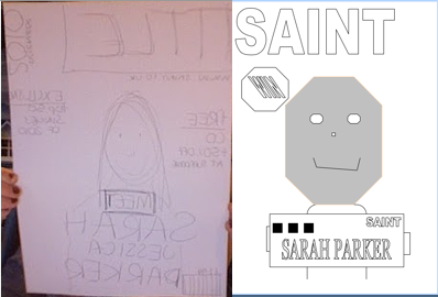
Firstly, I sketched a few ideas on to some paper and made a rough copy of how I may like the magazine to look. I then transferred the ideas on to the computer and created computer aided designs which I hope my target market will be able to see as containing a few conventional codes and conventions.
 

Flatplan 1: 


Flatplan 2:


I showed these ideas for my magazine front cover to a sample group of my target market and asked them which one they preferred. These are my results:

Sunday, 5 December 2010

Research into Typography

Though you may not think it, the font of the text is one of the main, most important things to think about when constructing a magazine. It paints a picture in the readers mind about what the genre of the magazine could be, what it would be about, the type of artists they would have in there etc.

What is Typography?
Typography is the art of arranging type, designing type, and modifying type glyphs. The arrangement of type involves the selection of typefaces, point size, line length, line spacing (leading), adjustment of space between groups of letters (tracking) and adjustment of space between pairs of letters (kerning).

Basic Type Anatomy


I have taken the time to look at some different titles of music magazines to not only differentiate between them, but to also explain what i believe they denote:


From this typeface, I can tell that the magazine will be edgy, grungy and heavy rock. 'Kerrang' denotes a particular sound of an electric guitar which is generally used in this genre of music. The font looks messy and the colour scheme represents this too with the use of black and white.


This typeface gives off a rock 'n' roll, 80s vibe as the font is flowing and sans serif. The colours of red and white give a vintage, british view of the magazine. The name Rolling Stone came from an old song which again proves that the magazine would have coverage of epic, legendary artists.


Besides the name being a big give away to the genre of the magazine, the font of the text is an even bigger give away. Recent studies show that the people tend to look at the font first, before they read the text. This font has a graffiti effect which is what most people associate the type of people who enjoy hip-hop music with. 

Integrate type with other design elements and develop the composition as a whole.
Type communicates on several levels:
  • Content: the word’s written meaning
  • Visual impact: use of type as a design element
  • Context: the content and visual impact of text in relationship with entire composition

No matter how fashionable or clever the design, if copy that is meant to be read is difficult to read -it is badly designed.

Thursday, 25 November 2010

Questionnaires for my target market

To research into my target market, I used a series of different methods. The first method I used was to give out questionnaires to the age range I have mentioned for my target market and gave it out to a sample of 10 people. This is a draft of the questions I have given out:

[Please click here to view]

Here are a few of the ones i got given back:


Photobucket


The variety of answers:

Do you regularly buy a magazine?
Yes 8 No 2

If yes, how often?
Daily 0 Weekly 5 Monthly 3 Other 2

Genres of magazine purchased:
Fashion 4 Sport 1 Technology 1 Gossip 2 Other 1

What name do you prefer for a music magazine?
Saint 6 Muse 4 The Beat 0 Other 0

What different aspects of a magazine draws you towards it?
  • The fonts and colours
  • The cover
  • Genre
  • Images on the front
  • Design throughout the magazine
  • The tidiness
  • The models
What tends to put you off buying a magazine?
  • Horrible layout
  • Price
  • The busyness of the pages
  • Tacky design
  • Content which is irrelavant to my interests
  • Bad Colour scheme
  • Amateur look
  • Adverts
  • Boring articles
  • Colourless, boring
  • Bad presentation
  • Too focused on one topic
  • Too repetitive
What colours would you expect if you were to buy a music magazine?
  • Bold colours
  • Retro colours
  • Bright colours
  • Blacks, dark colours but with vibrant colours (majority of vote)


Wednesday, 24 November 2010

Names for the Magazine


Examples of music magazine names:

  • Mojo
  • NME
  • Kerrang
  • Q
  • Rolling Stone
  • Wire
I have come to the conclusion, after looking at various music magazine titles, that the names of the magazines generally are words associated with music with connotations of the genre of the music my target audience will be interested in. The titles are generally punchy, short, simple and easy to remember. Therefore, here are my ideas for my music magazine...


I have developed this mind map of the ideas of names for my magazine:


The name I have chosen for my magazine is 'Saint'. This is because I think it provides the right codes and conventions for the genre of my magazine, and teamed with a good photo for the front will play a good role in showing my target market that this magazine is for them.


Sunday, 21 November 2010

Photographs taken which could potentially be in the magazine


Photo 1:

I think this would be the best photo for my front cover as the model is looking at the consumer, the lighting is perfect and it is black and white, which is what i intended to use.

Photo 2

I think this photo is over-edited for my front cover, but could be used for A4 sized photoshoot pictures in the magazine. I think the colour boost in this photo is too much and the saturation has been put too high as well.


Photo 3

If i were to use this photo, I think it would look best in my double page spread as A4 size. This is because the model has no eye contact with the consumer and looks very natural. 

Photo 4

I think this photo would be better for the double page spread or the contents because it looks extremely edited and couldn't be used on the front cover because it is landscape and looks sort of 'cold' and I think it would send away any consumers.

Here are some more photos I have taken but have taken the liberty in showing them from a photobucket link in a slideshow form. The slideshow should show the majority of the photos I have taken with their edited photo next to it. Please use the play, forward and back buttons to change speeds.
** PLEASE PRESS 'VIEW ALL' TO SEE HOW I EDITED THE PHOTOS**