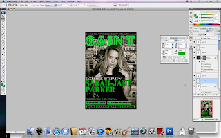
My main next focus was to settle on a font. I decided I didn't like the current font I had left it in because it looked too unprofessional. The font needs to stand out and look as though it was made by a professional and wasn't just drawn up on a program such as Word or such.
I settled with a font called 'Polar Shift' which I think has achieved it's purpose of making the magazine look more professional and edgy.
I then thought the right hand side of the magazine looked too bare so I moved some things around.
This is my finished front cover:


No comments:
Post a Comment