Sunday, 6 March 2011
Saturday, 5 March 2011


Product Evaluation
In what ways does your media product use, develop or challenge forms and conventions of real media products?
How does your media product represent particular social groups?
What kind of media institution might distribute your media product and why?
Who would be the audience for your media product?
How did you attract/address your audience?
What have you learnt about technologies from the process of constructing this product?
*Please click here to view the script if writing is hard to read*
 |
| Music Magazine |
 |
| Student Magazine |
Wednesday, 16 February 2011
Audience Feedback
Introducing my magazine to a sample of my target market:
I chose to ask questions to a female and male because I think that there will be some men who will enjoy the magazine and I wanted to see this male's point of view.
I chose to ask questions to a female and male because I think that there will be some men who will enjoy the magazine and I wanted to see this male's point of view.
The questions I asked them were:
1. what do you think is the best feature on the front cover?
2. what do you think about the colour scheme used?
3. do you think the design is adamant all the way through?
4. do you think my typography is appropriate for my target audience of young female adults?
5. what would you improve about the magazine?
6. do you think the price is suitable?
7. what do you like about the magazine?
8. would you buy it?
Wednesday, 19 January 2011
Making the Contents Page

I started off with the edited picture from iphoto which was then transported to Photoshop. I then fixed some blemishes after adding a layer.

I then used the magnetic lasso tool to cut out the model and flipped the photo vertically so it would look more aesthetically pleasing to the eye on the page.

I could then send the picture to a plain sheet of paper on Photoshop. I used the pick up colour tool to choose the background of the colour, then added text with a white background. I then used the magnetic lasso tool again to outline the image so it looked more professional.

Lasly, I added text such as the date and pages. This is my final contents page.
Monday, 17 January 2011


Monday, 3 January 2011
Making the Double Page Spread

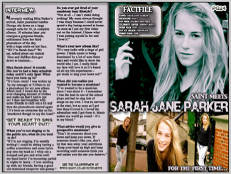
The image was put into photoshop and stretched to cover the whole page. I then added the text in the left top hand corner the word 'interview' to make it sure that my audience are aware this is an interview.

Here I have added a big title of a potential quote from the artist's interview. I did this because this is common in music magazines. The font I have chosen is Polar Shift and is the same as my logo. The white box was added with a border which attempts to contrast with the colours in the photo. The box is intended to hold the interview in. The next thing I will add in are polaroid style photos from the photographs I have taken.
Here is an example:

I did this by Google Imaging pictures of polaroid photographs, then cropping out the photo in the middle and adding my own. I continued to do this with another two pictures.

Here I am adding the polaroid to the double page spread, attempting to slant it to give the impression of layering.

I decided to layer the polaroids this way as it is more aesthetically pleasing to the eyes.
This is my original finished double page spread without the interview but when I looked at it, I thought there was too much text in the main title and the layout of the whole page looks too messy. I decided to do some alterations to it


Subscribe to:
Comments (Atom)